Logs, metrics, traces and still no answers
The practice of observability within organizations hasn’t changed much: anticipate possible failures, monitor the signals, and wire up alerts. The usual suspects: RUM, RED, USE, HTTPxx codes, latency percentiles, RPS, CPU %, memory usage, the load avg trifecta [1m/5m/15m].
Yet, despite this vast amount of telemetry – an average enterprise produces terabytes of telemetry per day1 – we often struggle to answer even the most basic questions about an incident.
The issue, as I see it, is that these dashboards are good at showing us symptoms, but not causes. Almost everything on the chart will often correlate. It also doesn’t help that, in production, “too many” things happen at once. A marketing campaign might cause a surge in traffic exactly when a new deployment introduced a regression. What caused the latency spike?
Engineers then carefully reason over the metrics and piece together a Root Cause Analysis (RCA). While I get the appeal of playing “detective”, it is generally error prone. Surely machines know how to learn by now?
Can we do better?
While looking for a better way to reason about incidents, I came across Causal Machine Learning which looked promising, and to my luck, some good folks at Microsoft and AWS have already done much of the heavy lifting in a library called DoWhy . The documentation does an excellent job of showcasing practical applications of causal modeling.
To put DoWhy into practice, imagine you’re running a simple three-tier web app – frontend, backend, database.
On a normal day at some hour, your operations look something like this:
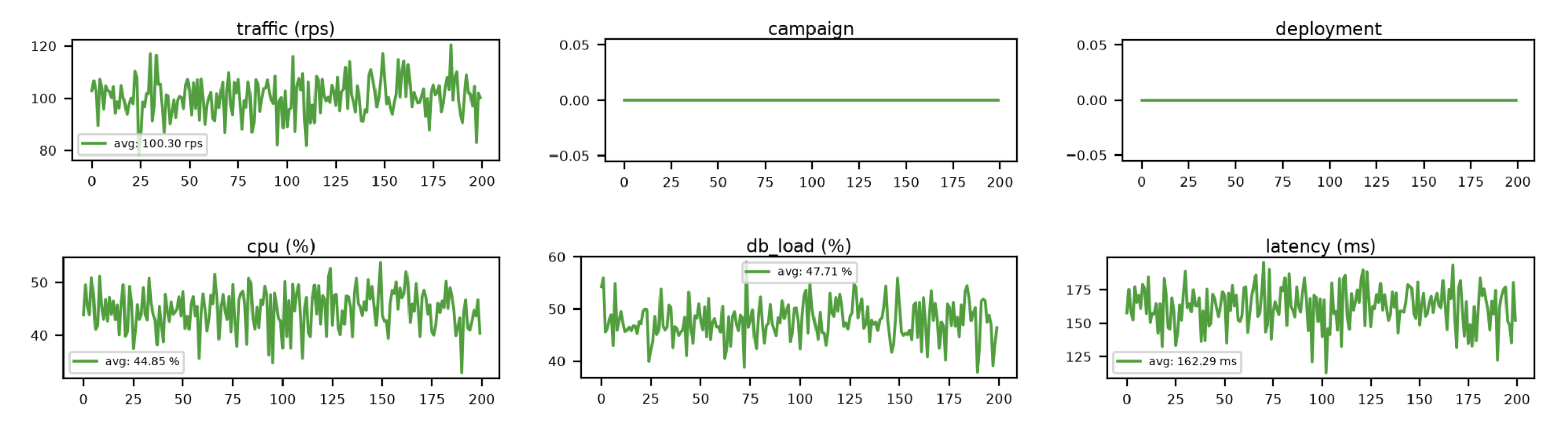
All data generated is synthetic to show if DoWhy works, check out Behind the Scenes below
Then, one day, you’re staring at this:
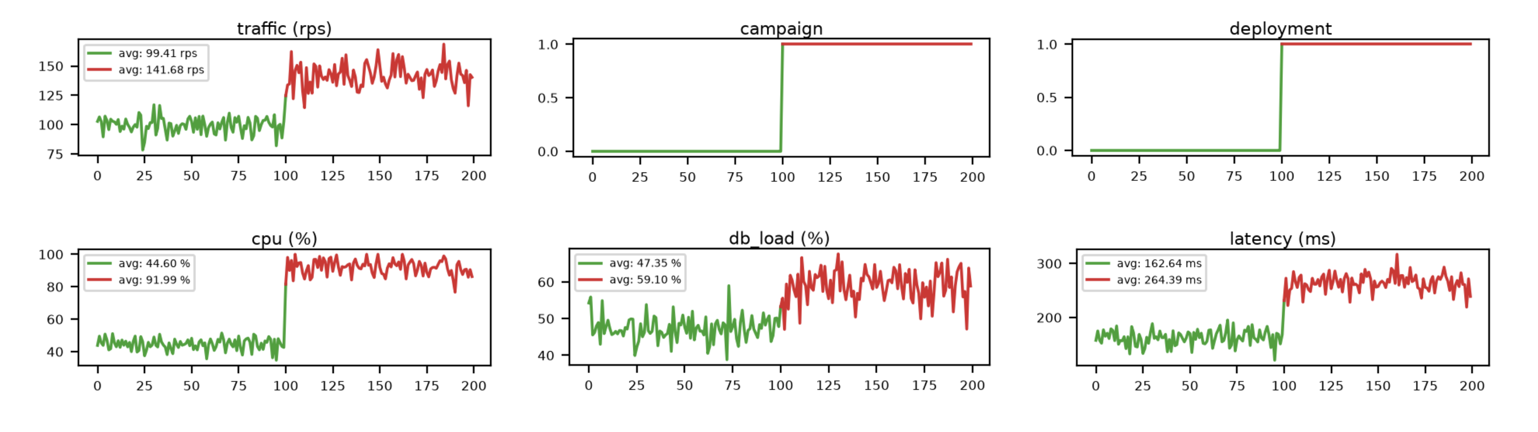
Let me point out that this is already a pretty decent dashboard. Alongside the usual metrics, it captures ongoing events such as the start of a campaign or a new deployment thus giving you valuable context for what was happening in the system that may have caused the incident.
The dashboard however doesn’t tell us which explanation to favor: Did the deployment introduce a regression? Or is this simply what the system would look like at this level of traffic that the campaign brought in?
Here’s another deployment without the regression while keeping everything else unchanged.
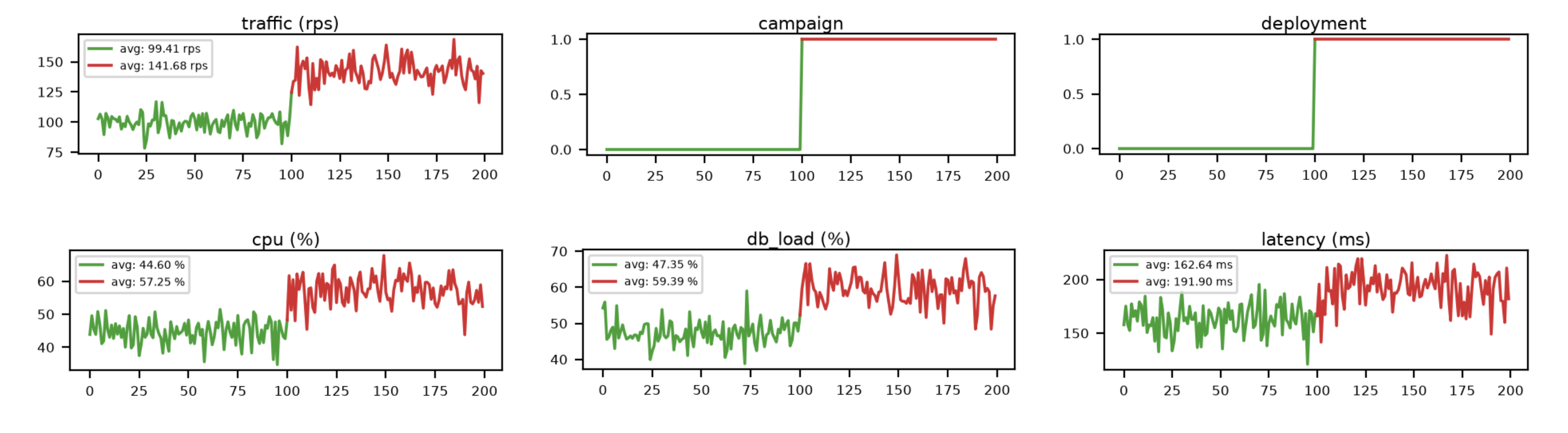
Once again, there’s the same spike in traffic. Latency also shifted though not nearly as much as before. The campaign and deployment took place just as they did in the previous incident. Yet this time, we controlled the deployment to not have a regression.
This dashboard likely already gives you some clue about the plausible relationships among various metrics, but remember: in production, we don’t get to simply flip the toggles and observe what happens.
So how does one tell them apart? In the first incident, you’d want to investigate the deployment. In the second incident, you could’ve safely ignored the deployment and looked elsewhere.
Hello DoWhy
Causal Graph
A causal graph is a DAG describing the cause-and-effect relationships between different variables. DoWhy has an experimental Graphical causal model based inference which is what we’re gonna use.
The graph gives the model a structure to work with. Domain experts in your organization can encode what they know about the system’s relationships over time as best as they can.
Here’s one possible causal graph for our example which should be fairly self-explanatory.
graph LR
      Campaign --> Traffic
      Traffic --> CPU
      Traffic --> DBLoad
      Deployment --> CPU
      Deployment --> DBLoad
      CPU --> Latency
      DBLoad --> Latency
A campaign may influence traffic, which in turn affects CPU usage and database load. A deployment can also affect CPU and database load independently of traffic. Both CPU usage and database load contribute to the request latency.
Individual teams could build and maintain causal graphs for the systems they understand best. In a large organization, a platform team could compose them together into an organization-wide view, allowing outages to be reasoned about across team boundaries if desirable.
Demo
Let’s now look at what DoWhy has to say about the two incidents. We’ll use the Distribution Change recipe for this. The question it answers is:
Distribution Change explains why a target variable changed between two datasets by attributing that change back to the causal mechanisms in the graph that contributed to it.
It attributes the change in a variable (e.g., latency) back to the nodes in the causal graph that may have caused it, and quantifies how much of the change each one was responsible for.
The following summarizes the distribution change DoWhy predicts for Fig. 2. Notice that it hasn’t singled out a single root cause.
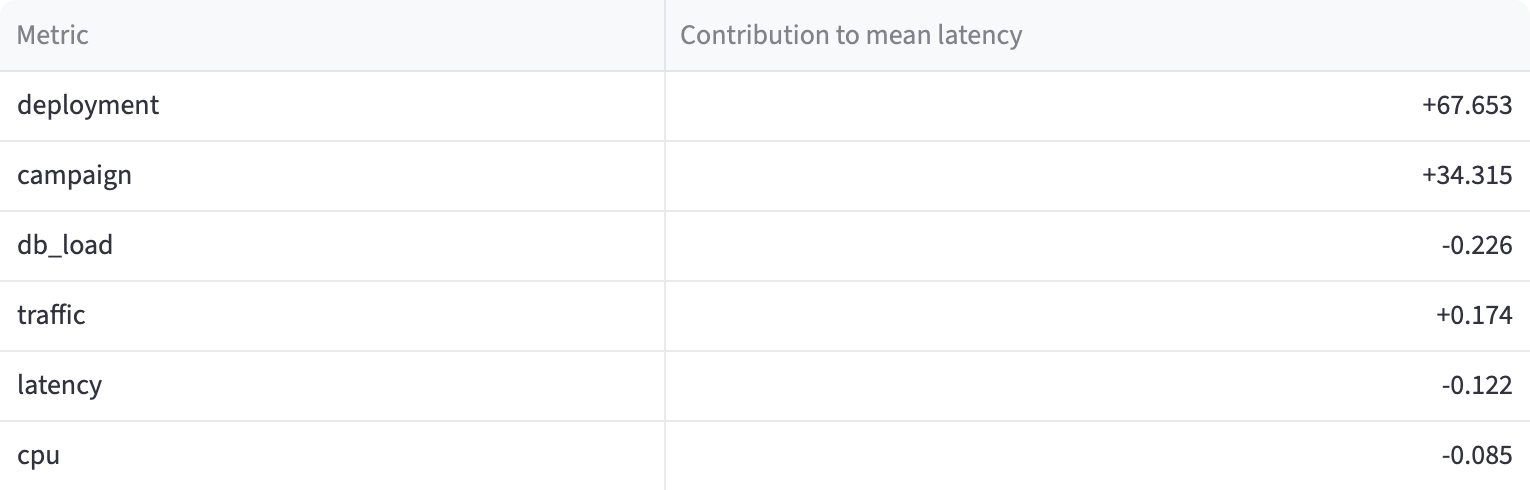
We know from Fig. 2 that our mean latency increased by roughly 100ms. The model attributes about 67ms to the deployment and 34ms to the campaign.
What happens when the deployment introduces no regression? Here’s the attribution for the second experiment, Fig. 3.
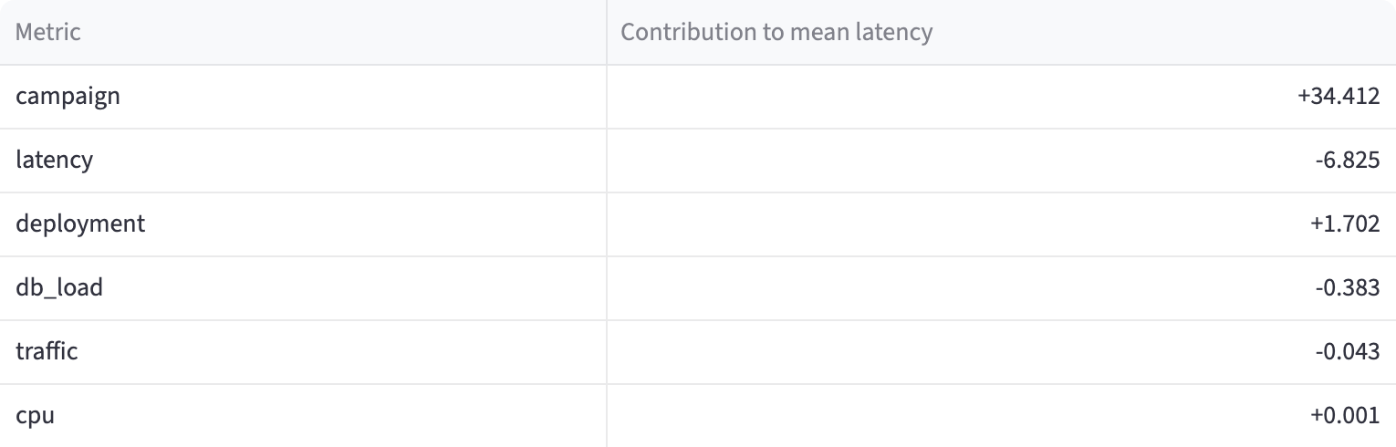
The campaign contributes roughly 34ms in both experiments. The deployment adds about 67ms in the first, but almost nothing in the second.
CPU usage increased in both cases, but it was never the root cause: adding capacity might have relieved the symptom, but fixing the regression is what would have resolved the underlying problem.
Apart from that, DoWhy also provides what causal ML calls intervention. Knowing the root causes is great, but engineers ultimately need to fix the situation. Intervention helps us answer “what-if” kinds of questions. For example, “what-if we vertically scaled the service and reduced CPU utilization to X%, how much would we expect latency to improve?”. Now that’s valuable!
A limitation of DAG however is feedback loops, for example, the classic Retry Storms. A DAG cannot contain cycles, but we can represent this across time by unrolling the DAG a few timesteps (at-least that’s what the documentation suggests):
graph LR
    L0["Latency[now]"] --> R1["Retries[now+5m]"]
    R1 --> T1["Traffic[now+5m]"]
    T1 --> L1["Latency[now+5m]"]
    L1 --> R2["Retries[now+10m]"]
Footguns
Causal ML is still a tool and the literature is clear about the possibility of surprising or misleading results if you aren’t being careful. Going back to our example, imagine the deployment never had a regression, but there was a hidden factor affecting CPU usage (e.g., power saver mode) that wasn’t modelled in our graph. It would still end up attributing the latency effects back to the deployment.
On this topic, I’d recommend reading about Confounders, Colliders, Mediators .
That doesn’t make the approach unusable. We can continuously revise the graphs as we better understand what impacts our systems, add more telemetry, and use canary deployments to give the model a baseline to compare the rollout against.
Applications
Cloud FinOps
Suppose your AWS bill jumps by 30% this month. Was it the increase in traffic? A new deployment consuming more resources? The team switching to larger instances? More expensive queries? Discount expiring? I’ve seen teams spend days figuring out what’s moving their cost up.
Debugging slow queries
This one has been particularly painful & seems like a good fit for causal attribution. Instead of showing which metrics moved alongside a slow query, a causal model could estimate how much each of those changes (CPU and I/O pressure, buffer cache hits/misses, lock waits, scan size, sorting) actually contributed to the slowdown instead of trial-and-error which is often the norm.
Automatic remediation
In our example, the same latency alert can have two different action items: investigate a release or accommodate more traffic. Rolling back a healthy deployment won’t make the campaign go away. Adding capacity might help, but you’re paying for the regression.
Causal attribution could help choose the right action.
Manageable on-calls and better postmortems
Enterprises face an awkward trade-off: keep rotations fine-grained, with every team carrying its own on-call burden, or consolidate them into fewer rotations. The former is expensive (hourly wage is a thing in some countries), the latter puts unfamiliar systems in front of you increasing on-call anxiety.
If causal attribution can narrow down the likely source, you’ve got free money.
Closing Thoughts
This demo was deliberately small and used synthetic data. Applying it to production systems might require more work. Still, the possibility of turning telemetry and domain knowledge into an explanation is a useful capability.
I hope this has intrigued you enough to question whether our current approach to observability is really state-of-the-art. Surely, what we need isn’t yet another time-series database.
Here are some books you can follow up on:
HMU if you think I’ve got anything wrong here :)
Behind the Scenes
The synthetic data was generated with the following Python function, which returns N samples for each variable:
def samples(
    n: int,
    rng: np.random.Generator,
    *,
    campaign: bool = False,
    campaign_multiplier: float = 2.0,
    deployment: bool = False,
    regression: bool = False,
) -> pd.Dataframe:
    campaign_effect = np.full(n, campaign_multiplier if campaign else 1.0)
    traffic = rng.normal(100, 8, n) * campaign_effect

    deployed = np.full(n, 1.0 if deployment else 0.0)

    # traffic naturally raises cpu
    cpu = 15 + 0.3 * traffic + rng.normal(0, 3, n)

    # new deployment adds extra cpu overhead (synthetic, so we know!)
    if deployment and regression:
        cpu += 35 + rng.normal(0, 2, n)

    cpu = np.clip(cpu, 0, 100)

    # db load mostly follows traffic
    db_load = 20 + 0.28 * traffic + rng.normal(0, 3, n)

    latency = (
        50
        + 2.0 * cpu
        + 0.5 * db_load
        + rng.normal(0, 12, n)
    )

    return pd.DataFrame({
        "traffic": traffic,
        "campaign": np.full(n, 1.0 if campaign else 0.0),
        "deployment": deployed,
        "cpu": cpu,
        "db_load": db_load,
        "latency": latency,
    })

Fig. 1: sample(100, rng, campaign=False, campaign_multiplier=None, deployment=False, regression=False)
Fig. 2: sample(100, rng, campaign=True,  campaign_multiplier=1.4,  deployment=True,  regression=True)
Fig. 3: sample(100, rng, campaign=True,  campaign_multiplier=1.4,  deployment=True,  regression=False)
The model never sees this generator code. It learns from the generated observations and the causal graph.